Macmillan Cancer Support - Type holding devices redesign and development
Panel creation
Illustration usage
Panel social posts
The brief
Whilst we were developing the new brand I was tasked to look at a new replacement for the paint brush panels and how they could work across all areas of the brand.
The creative solution
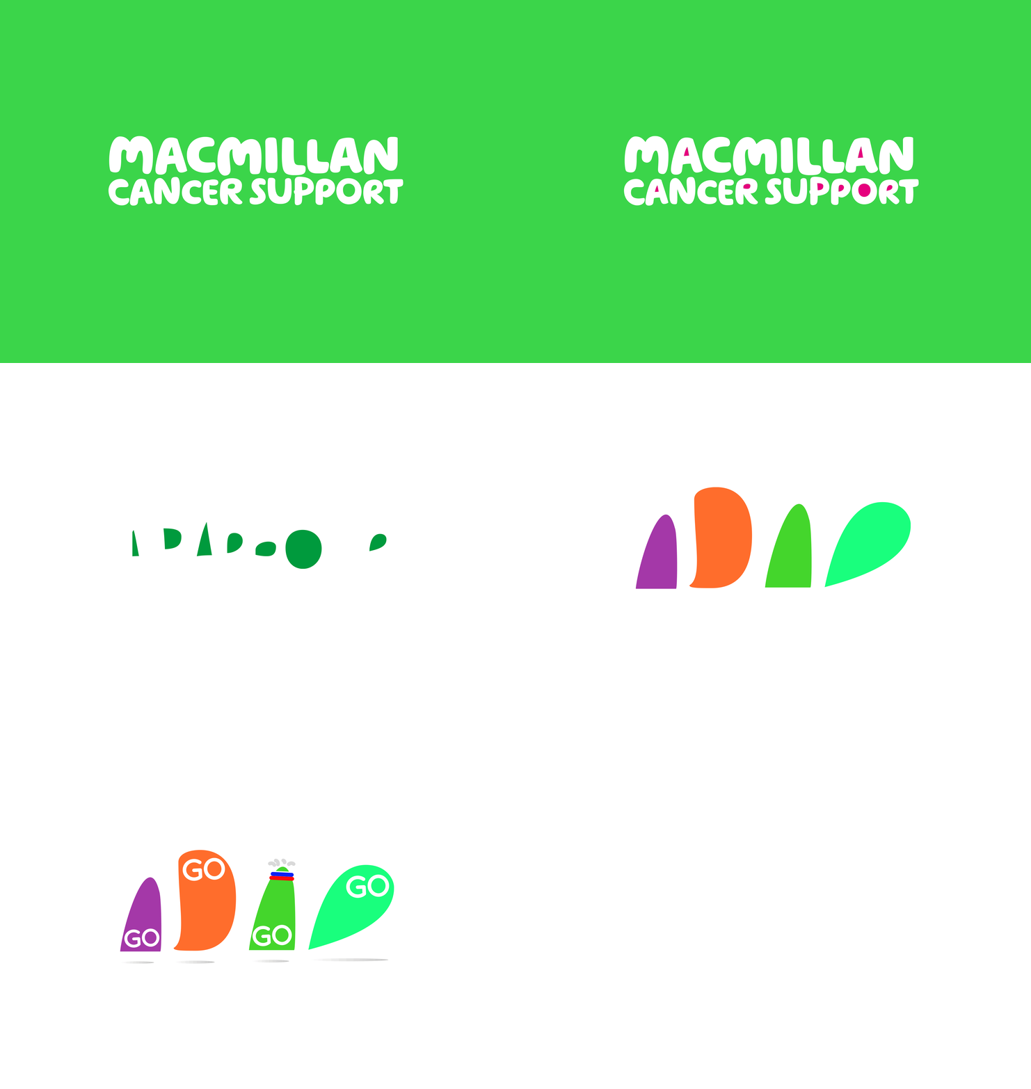
I started by looking at the heritage of the Macmillan brand. This led me to the headline font which is the most recognisable element in Macmillan’s branding. I had a variety of possible ideas, but I was mindful not to over saturate the brand, but still wanted keep a core relationship to the font.
This led me to break apart the font, leaving me with a series of shapes. I decided to use the less recognisable shapes created by the counters within the font to avoid the over usage issue. This left me some great illustrative shapes. These shapes were then developed into two different moods to represent the feel of the good spirit of fundraising and a more subtle togetherness of support.
I also helped the overall feel by applying different colour palettes to the panels, creating a different tone for different areas of the organisation.
Below is how these would be applied across the organisation and possibly moving into animation.
Campaign promotional use


