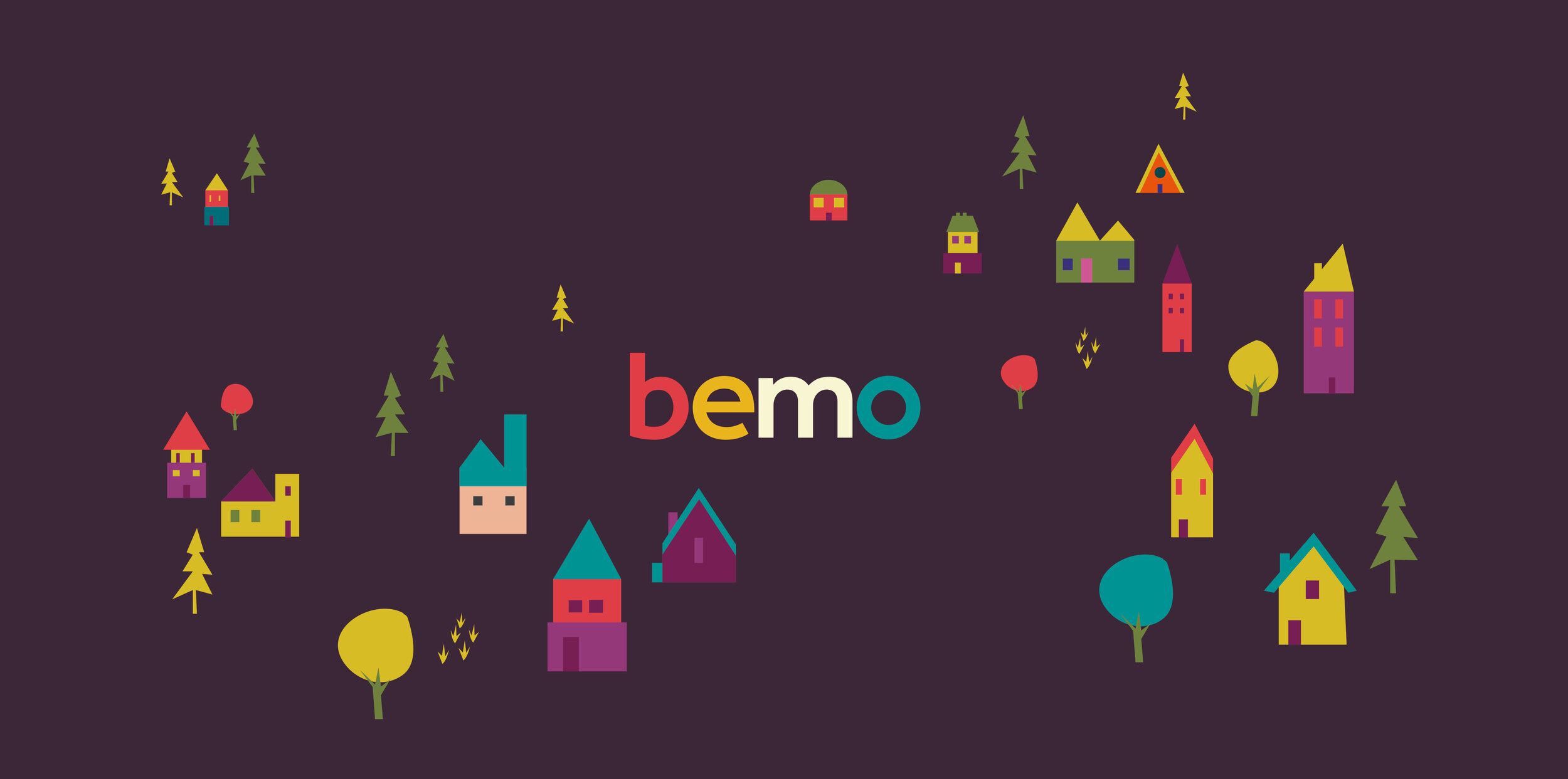
Bemo branding & illustration
Logo design
Microsite design
The brief
The brief was to create a friendly brand aimed at younger house hunters looking to purchase or rent property. The name was a mixture of the two owners, so the branding had to work harder to stand out in the over saturated estate agency market to be interesting visually.
The solution
I opted for a multi coloured palette with the introduction of house illustrations. This made a simple bold, colourful brand that is striking and appealing and when paired with the houses it creates a fresh homely feel.


